Terry Burkes
Interface Design Portfolio . 2 of 2

See Interface Portfolio 1


visa event interactive tour Levi Intranet Project I created the visual content, designed the general layout, and crunched most of the html code.

The priorities: extremely casual and warm, yet clean, professional look and feel. Highly intuitive interface.

I cant show you the confidential text, but I've included some graphics with subtitles & faux text so you can get a feel for the general layout and interactivity.

Producer: Connect Media


NBMA logo

NBMA's site

NBMA Logo Redesign I modified the pre-existing 1 color print logo for the North Bay Multimedia Association's web site.

The priorities: maintain continuity with the highly popular regional newsletter, while adding visual excitement and interest. Contemporary, professional, yet hinting at the natural beauty of the North Bay's golden hills and sky.

Art Director: Sharon Rockey.


Litton/Filtronic Solid State Wireless Solutions Roll Overs and Animated Interface Designed for a promotional presentation CDROM. I created all the content (except for the original rainbow menu image map and earth image which I repurposed.)

The priorities: create high tech, dynamic, look and feel emphasizing space age communication technologies, using the pre-existing branded themes.

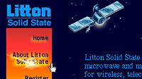
The blinking patterns of the satellite and earth bound stations match to underscore Litton's efficiently coordinated communication systems. Common palettes created for seamless visual integration between animations, images, and background tiled image. Rollovers designed to coordinate with preexisting rainbow "spectrum" menu.

HTML/Java by Digiville Media.

Art Director: Lee Callister.


GNN masthead

GNN
banner w type

Remnants of the GNN site

GNN Mastheads Mastheads for GNN's web site commemorating Take Our Daughters to Work Day (a national annual event). Meant to inspire and inform girls about their career options, parents are encouraged to take them to work place for the day. I have no idea if this site has been resurrected somewhere else since 1996, but the last vestiges I know of are on the Art Director's site.

The priorities: Big, bold, beautiful. Metaphor for seeing one's future in the looking glass, but with more options than Alice had way back when!

Art Director: Sherry Miller.

See Interface Portfolio 1
home  |  portfolio directory  ||  bio

All images ©Terry Burkes '94-2001, please obtain permission to use.

Site designed and maintained by Terry Burkes
terry@tburkes.com